How to Build a Classification Model in Minutes: A Cirrhosis Stage Prediction Pipeline

By the end of this, you'll know:
- →Adding Data from Kaggle
- →Processing Your Data
- →Visualizing with AI-Suggested Plots
- →Training Your Model
- →Viewing Results & Insights
- →Deploying Your API
#How to Build a Classification Model in Minutes: A Cirrhosis Stage Prediction Pipeline
Building machine learning models used to require tons of code, data wrangling, and debugging. Not anymore. In this tutorial, we'll build a complete classification pipeline to predict cirrhosis stages using real data from Kaggle. No coding required.
By the end, you'll have a trained model, visualizations, and a working API. Let's dive in.
#⚡ Pro Tip: The 3-Click Shortcut
Want to skip the setup? Look below the chat bubble for pre-built templates. Click on the Classification Template or{" "} Regression Template, add your data, and hit "Run Flow". That's it. Three clicks and you're done.
The tutorial below shows you how to build everything from scratch so you understand each step. But once you know how it works, templates are your fastest path to production.
#Step 1: Adding Data from Kaggle
First, we need data. You have two options.
Option A: Use the chat interface
Simply type: "I want to add data. Create a node for me"
The AI assistant will add a data loader node to your canvas. Click the plus icon on the node to open the data upload area.
Option B: Ask the AI to do it all
Or skip the manual steps and just type: "Add an open source dataset about the cirrhosis stages for me"
The AI will search Kaggle, find the cirrhosis dataset, and add it automatically.
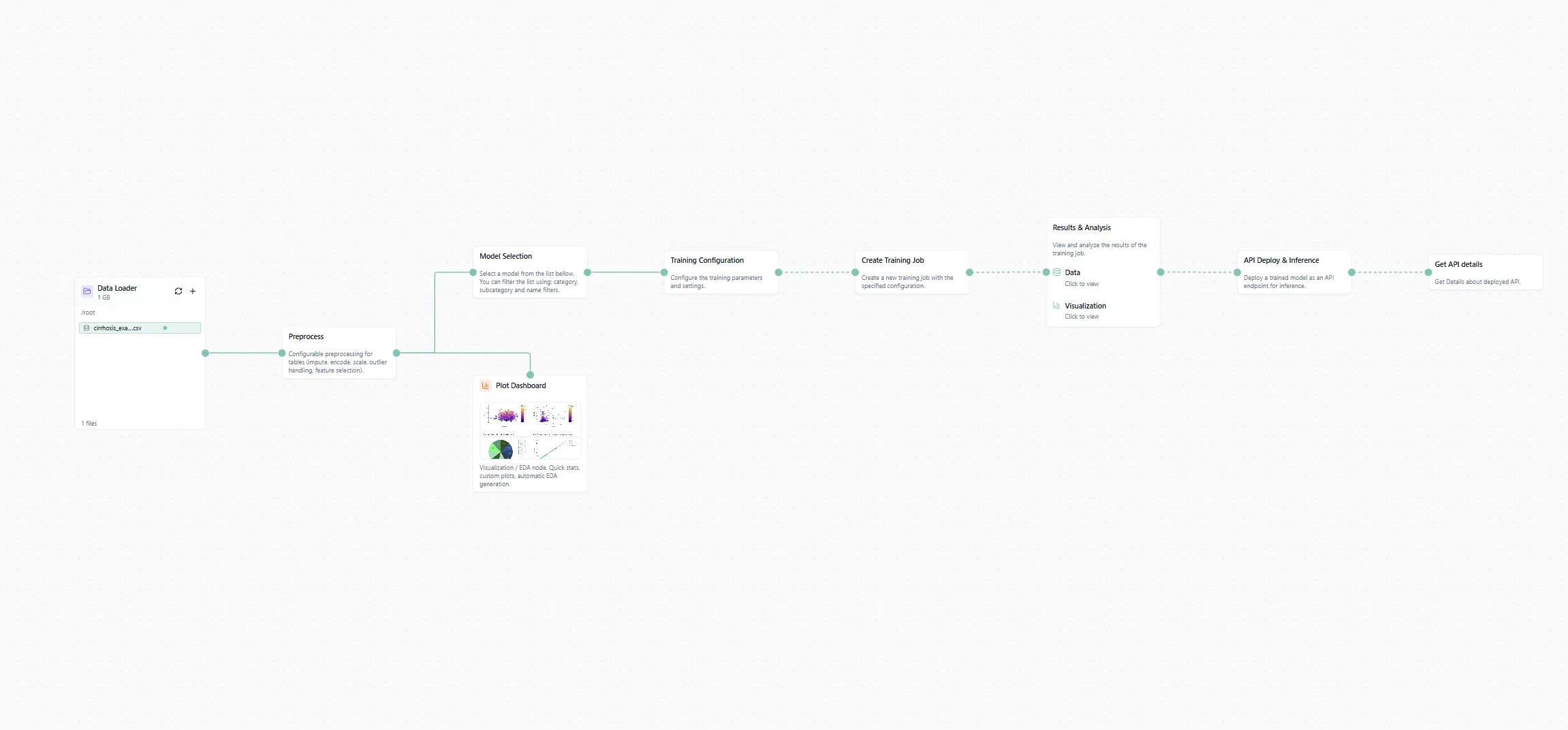
Figure 1: The workflow canvas with our cirrhosis dataset loaded.
If you're doing it manually, switch to the Kaggle tab in the data loader, type "cirrhosis" in the search bar, and select the dataset. Done.
#Step 2: Processing Your Data
Raw data is messy. We need to clean it up before training.
Add a processing node to your canvas. Then prompt the chat:
"Adapt the processing settings so we can use this data for an AI pipeline"
The AI will configure data cleaning, handle missing values, encode categorical features, and prepare everything for training. No need to write pandas code or deal with NaNs manually.
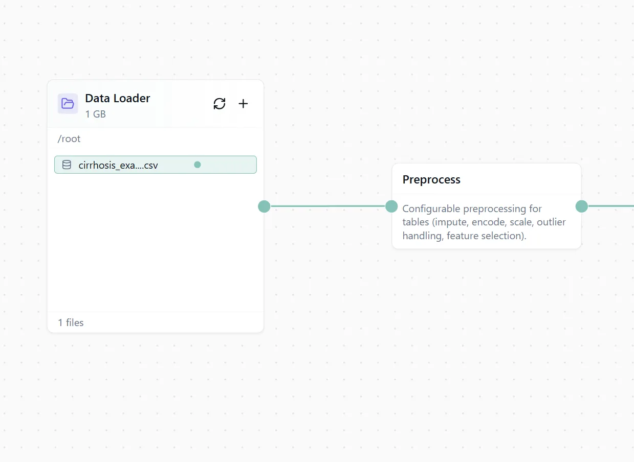
Figure 2: Automated data processing configuration.
#Step 3: Visualizing with AI-Suggested Plots
Before training, let's understand our data. Time to add some plots.
Switch from the Assistant tab to the Library tab in the left sidebar. Scroll down and select the Plot Dashboard node. Drag it onto your canvas and connect it to your processing node.
Now here's the cool part. Click "Add Plots" and select "AI Suggestions". The AI will analyze your data and suggest relevant visualizations phrased as questions:
- "What's the distribution of cirrhosis stages?"
- "How do bilirubin levels correlate with disease progression?"
- "Which features show the strongest relationships?"
Pick the ones that look useful and add them to your dashboard.
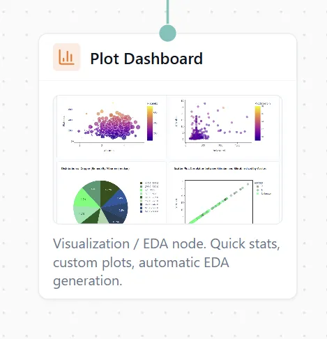
Figure 3: AI suggests plots based on your data.
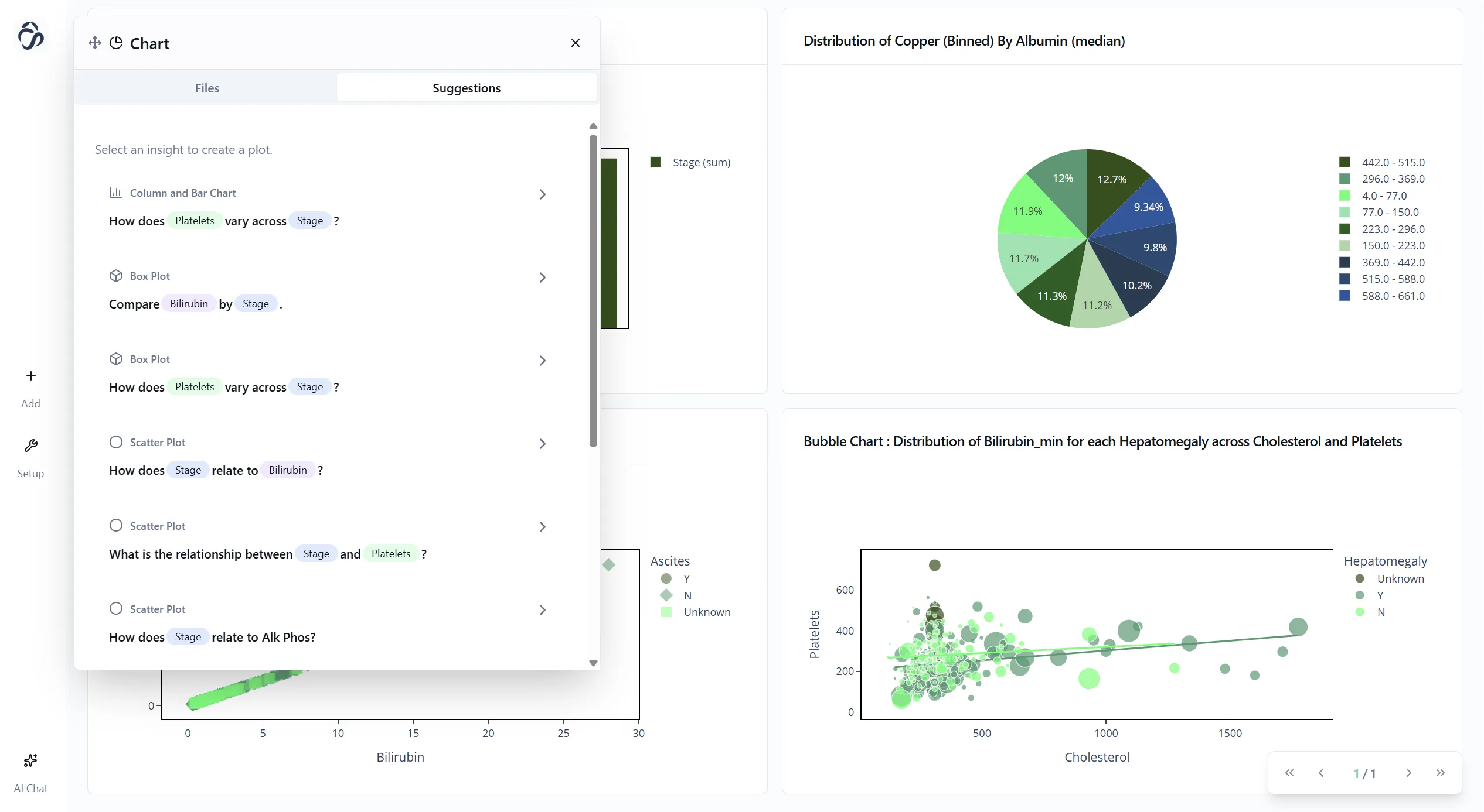
Figure 4: Your beautiful dashboard with AI-generated insights.
You can also export these plots if you want to use them in a report or presentation. Just click the export button on any chart.
#Step 4: Training Your Model
Now for the main event: training a classification model.
Add three nodes to your canvas:
- Model Selection node
- Training Configuration node
- Create Training Job node
Then prompt the chat: "Add the configuration for a classification model"
The AI will:
- Select an appropriate algorithm (Random Forest, XGBoost, etc.)
- Set up hyperparameters
- Configure train/test splits
- Prepare the training pipeline
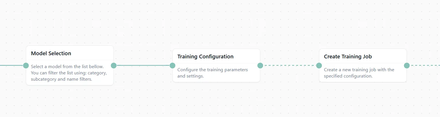
Figure 5: The ML training pipeline configured and ready.
Connect everything in sequence: Data → Processing → Training Nodes
#Step 5: Viewing Results & Insights
Once training is configured, add a Results & Analysis node. This node will show:
- Training performance metrics (accuracy, precision, recall, F1 score)
- Feature importance rankings
- SHAP values for explainability
Now click "Run Flow" at the top of the canvas.
Go grab a tea. Training might take a couple of minutes depending on your dataset size.
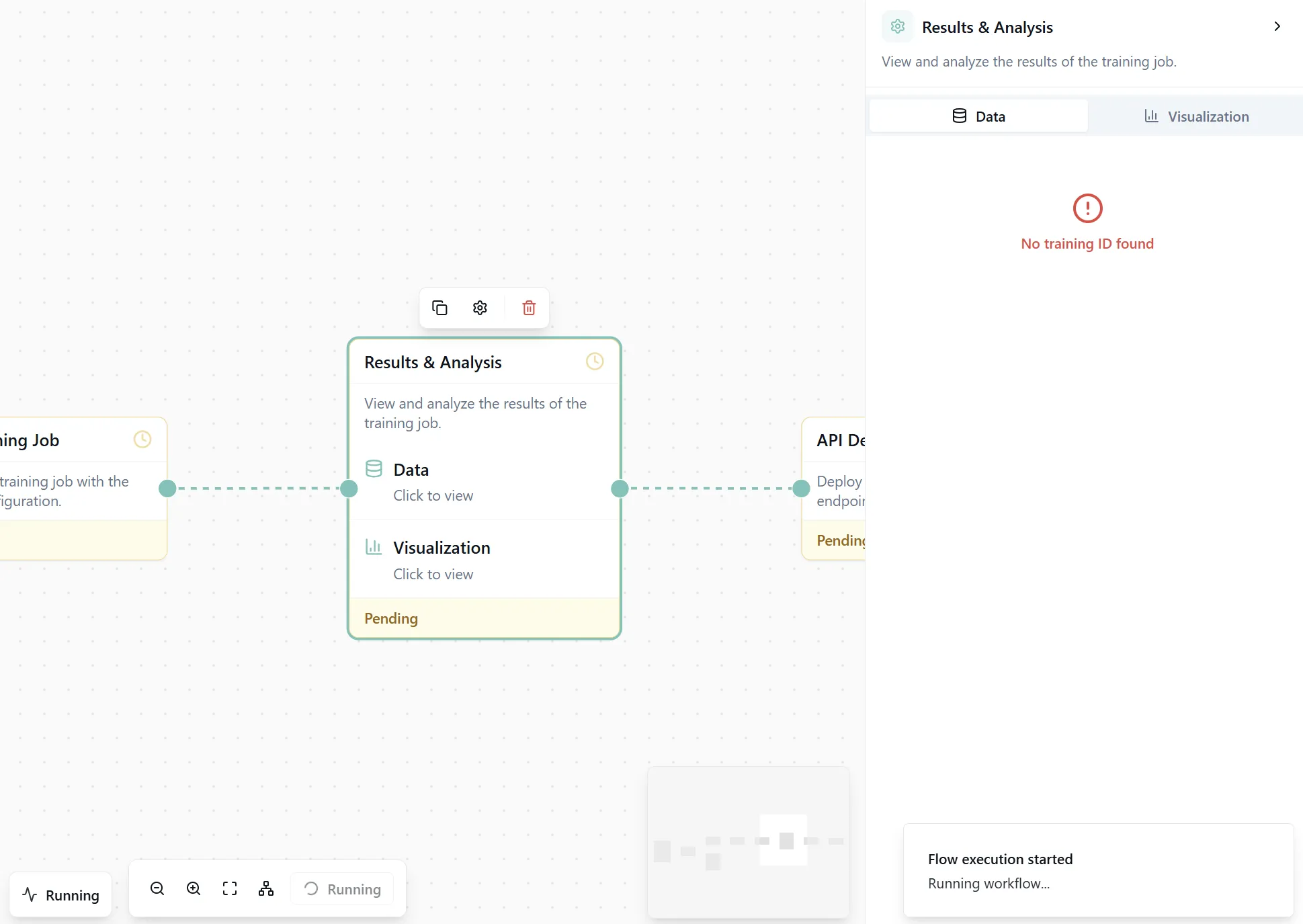
Figure 6: The complete workflow ready to execute.
When execution finishes, open the Results & Analysis node. You'll see detailed performance metrics and visualizations.
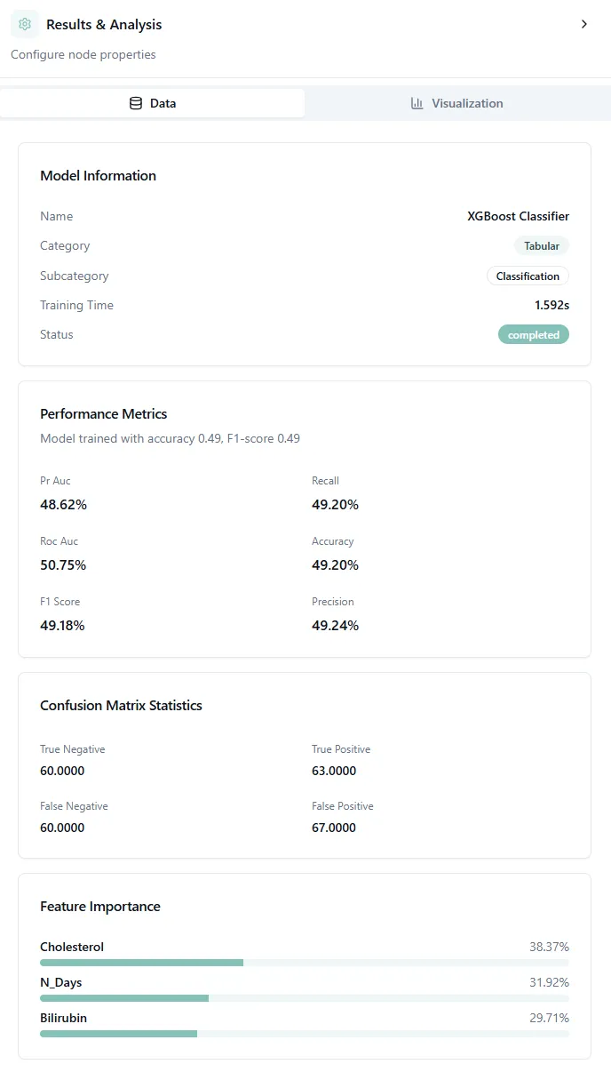
Figure 7: Model performance metrics and confusion matrix.
#Understanding the Confusion Matrix
The confusion matrix is one of the most important visualizations for classification models. It shows you exactly where your model gets things right and where it makes mistakes.
How to read it:
The confusion matrix is a grid where:
- Rows represent the true (actual) cirrhosis stages
- Columns represent what your model predicted
- Diagonal cells (top-left to bottom-right) show correct predictions
- Off-diagonal cells show misclassifications
For example, if you see a bright square at row "Stage 2" and column "Stage 3", it means the model predicted Stage 3 when the actual stage was Stage 2.
What good results look like:
A strong model has:
- Bright diagonal: Most predictions fall on the diagonal (correct classifications)
- Dark off-diagonal: Few misclassifications away from the diagonal
- Adjacent errors: When mistakes happen, they're usually to adjacent stages (Stage 2 confused with Stage 3) rather than extreme jumps (Stage 1 confused with Stage 4)
Interpreting your results:
In medical classification like cirrhosis staging, adjacent stage confusion is often acceptable because:
- Disease stages exist on a continuum
- Even doctors sometimes disagree on borderline cases
- Clinical labs have measurement variability
But you want to avoid large errors. A model that confuses Stage 1 (early disease) with Stage 4 (advanced cirrhosis) would be clinically dangerous.
The performance metrics shown alongside (accuracy, precision, recall, F1) give you the overall picture, but the confusion matrix tells you how your model fails, which is often more important than just the accuracy number.
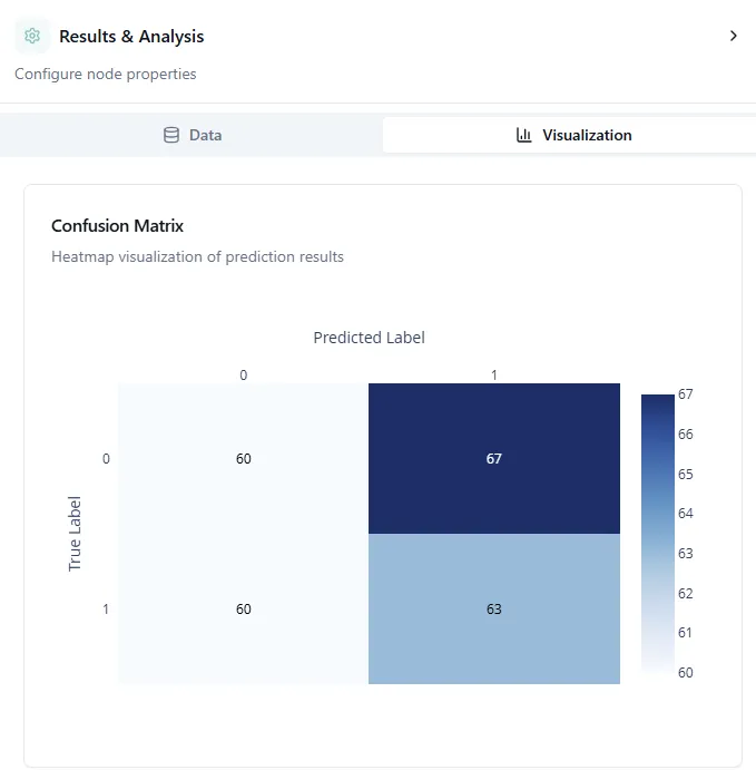
Figure 8: Global feature importance bar plot.
#Understanding the Global Bar Plot
The global bar plot shows which features have the biggest impact on your model's predictions. The bars are ranked from most important (top) to least important (bottom).
In this cirrhosis example, you might see features like bilirubin levels, albumin, or age at the top. These are the biomarkers your model relies on most when predicting disease stage.
This helps you understand:
- Which medical tests or measurements matter most
- Where to focus data collection efforts
- Which features you might safely remove to simplify the model
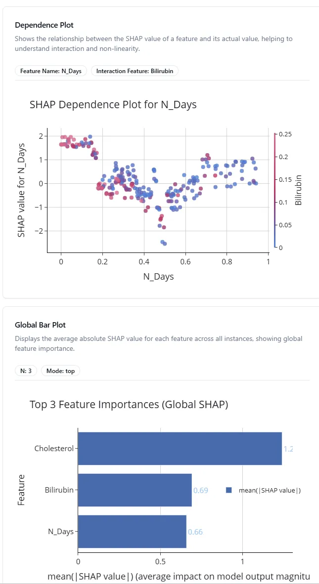
Figure 9: SHAP dependence plot showing feature relationships.
#Understanding SHAP Dependence Plots
SHAP (SHapley Additive exPlanations) dependence plots show how a feature affects predictions. Each dot represents one patient in your dataset.
Here's how to read it:
- X-axis: The actual feature value (e.g., bilirubin level from low to high)
- Y-axis: SHAP value (how much this feature pushes the prediction up or down)
- Color: Often shows another feature's value to reveal interactions
For example, if you see an upward trend from left to right, it means higher values of that feature lead to higher predictions. A flat line means the feature doesn't have much effect. Scattered patterns suggest complex, nonlinear relationships.
This is incredibly useful for:
- Validating that your model learns medically sensible patterns
- Discovering unexpected relationships in your data
- Explaining individual predictions to doctors or stakeholders
#Step 6: Deploying Your API
Your model is trained and performing well. Now let's make it usable outside the platform.
Add two final nodes:
- API Deploy & Inference node
- API Details node
The API Deploy node creates an endpoint for your model. The API Details node shows you:
- The API endpoint URL
- Authentication tokens
- Example code snippets in Python, JavaScript, and cURL
- Request/response formats
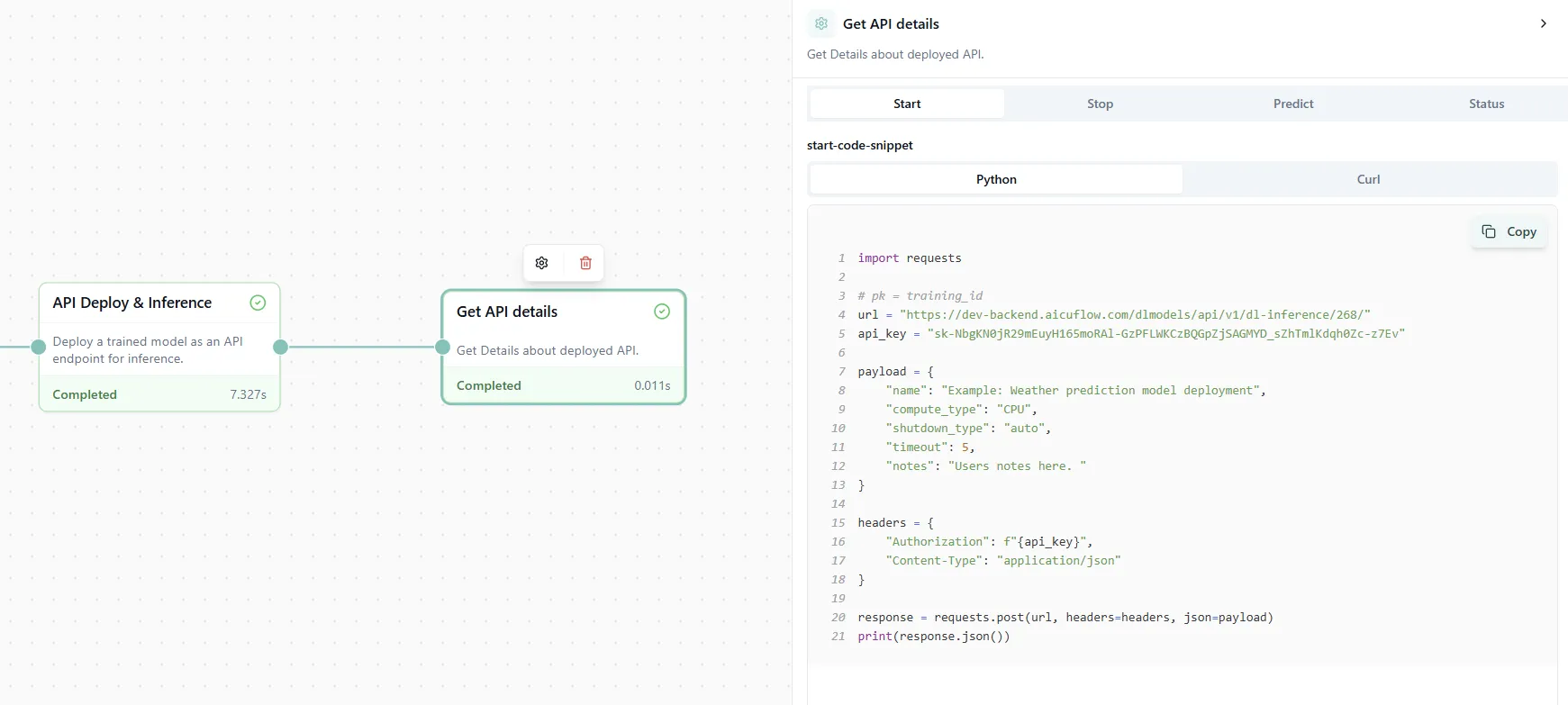
Figure 10: API deployment details with ready-to-use code examples.
Now you can call your model from any application, website, or script. Just copy the code snippet in your preferred language and start making predictions in production!
#Wrapping Up
In less than 10 minutes, you've:
- Loaded real data from Kaggle
- Cleaned and processed it automatically
- Created insightful visualizations with AI suggestions
- Trained a classification model
- Analyzed results with explainability tools
- Deployed a production-ready API
No code. No debugging. No environment setup.
This is the new way of building ML pipelines. Fast, visual, and accessible to everyone.
Remember: Once you're comfortable with the process, you can use the pre-built Classification or Regression templates (found below the chat bubble) to set up everything with just three clicks: select template, add data, run flow. Perfect for when you need to move fast.
#References
[1] Cirrhosis Prediction Dataset. Kaggle. https://www.kaggle.com/datasets/fedesoriano/cirrhosis-prediction-dataset
[2] SHAP (SHapley Additive exPlanations). https://github.com/slundberg/shap